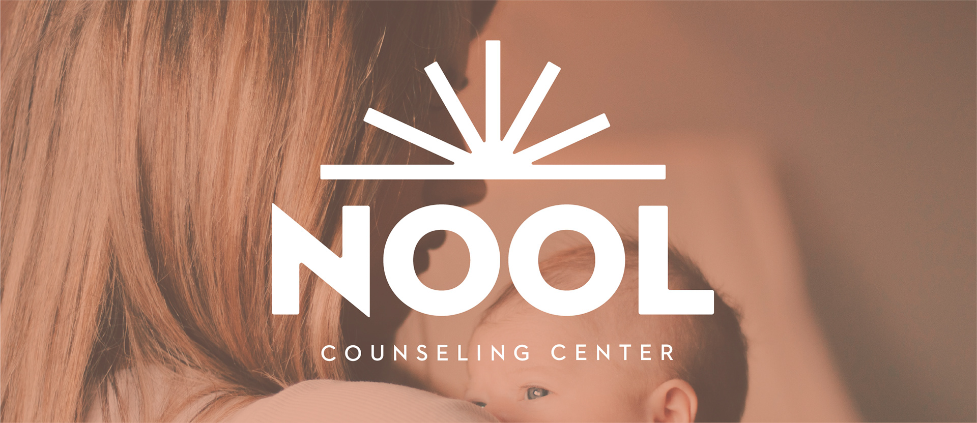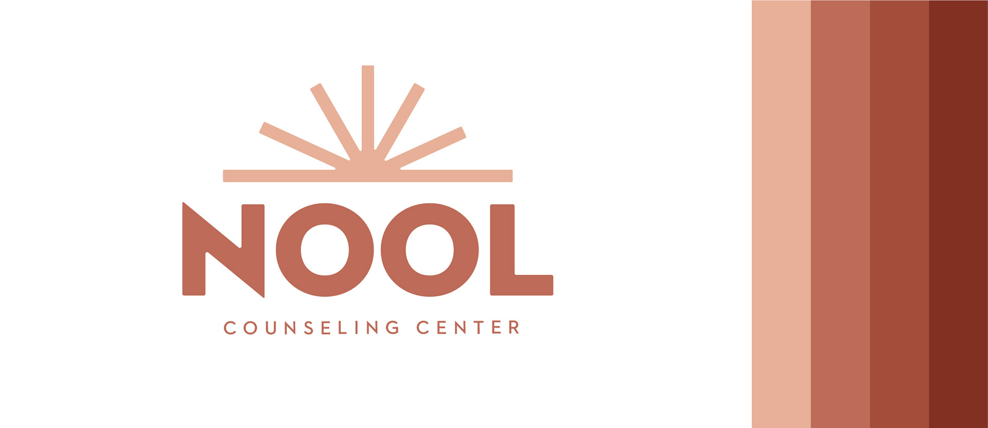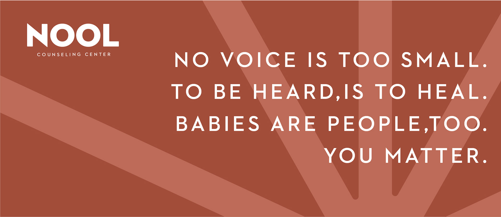
Nool is a counseling center that has mostly specialized in women and perinatal clients. They were looking for a rebrand that does cater to women, but if they start leaning towards male clients as well, they wouldn't be put off. Their original brand was white, soft pink, and gray. The new palette is bolder and less feminine. They wanted a bold mark. I used the icon to represent the different pathways Nool can show people to heal. It also represents the many different types of cases they cater to.